|
3/27/2019 0 Comments Watercolor Perspective
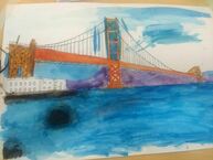
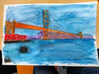
I used 1 point perspective. I did a picture of the Golden Gate Bridge from when I was living in California. I messed up painting some parts of the picture, and it was really difficult trying to fix it. The sunset warm up gave me a better idea how to use perspective and how to paint the backgrounds and foregrounds. The block letters helped with learning how to draw in perspective.
0 Comments
2/28/2019 0 Comments Watercolor warm-up
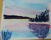
I found the sunset warm up the best because I liked how it was to do it. I find watercolor easier to deal with than acrylic paint. However, it’s hard because you don’t really have much room to mess up and if your paint is too watery it runs everywhere.
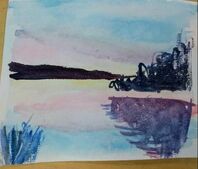
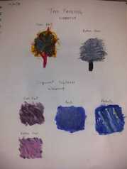
2/28/2019 0 Comments The Idea of a Place
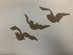
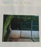
These two pictures (bottom row) are my in progress pictures. They are pictures of when this was just an idea, and I hadn't started painting yet. The place represented in my art is Bangalore, Karnataka, India. It's where I'm from. I moved there when I was 8 and lived there for 8 years. It's my second home. The city is really polluted and there aren't many birds. However, there are a large number of crows. The crows are the the view from my 9th/11th floor apartment flat.
I think the hardest thing for me was to paint the crows without getting it everywhere. I also needed to cover the painting below it that I was planning to do but didn't. I think making the birds look like they were flying was the most successful piece. I also gave an unintentional feeling of serenity and calmness which was great too! :) I started by priming the canvas. Then I painted the background a blue-grey to show the morning sky. When that dried I drew the crows and painted them black.
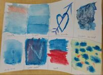
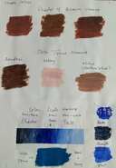
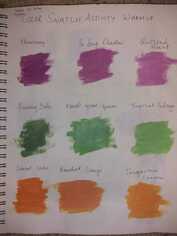
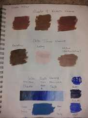
I am not really happy with how my painting warm ups turned out, but since it's the beginning of the unit I'll give it the benefit of doubt. We learned different painting techniques in these warm ups. We learned how to create different textures with paint, like fur, rock, and fabric. We learned how to paint a tree and how to mix colors to get different shades, tints, and tones of one color, or mix different colors together to get new colors. We learnt ow to make brown.
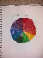
I think the color wheel and the texture warm ups will be the most helpful ones. The color wheel will tell me what colors to mix together to get the color I want. The rock texture will help me paint a wall. I learnt the most from the mixing colors one because it showed me how to mix colors together. It also showed me how even a little more of one color over the other could make a huge difference in the end color. Mixing colors like red and green together, mixing orange and purple, mixing blue and orange are some ways to make brown. Mixing colors that are opposite to each other on the color wheel usually get brown as the result. Adding either grey to that color or adding the color that is opposite to it on the color wheel are some ways of toning a color down.
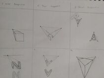
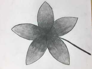
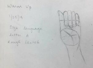
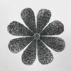
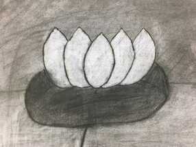
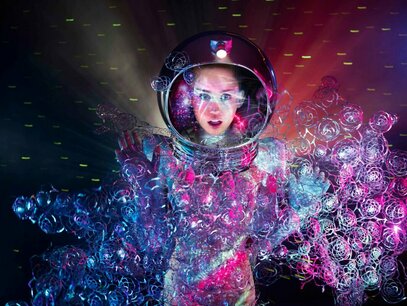
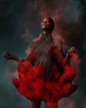
 These are my project for the intro to drawing unit along with the most helpful warm-up we've done until now. I was really indecisive about my theme, so I kept erasing my sketches. While that was okay with my pencil and pen drawings, my charcoal drawing really suffered. That was a mistake I won't be repeating. I think that the most helpful warm-up during this unit was the sign language letter A one. It helped with having us think of drawings as shapes and add details later. It helped a lot with practicing getting proportions right when drawing. Composition is how your eye focuses on the art. It is the placement or arrangement of the elements on the art. Value is the element of design that defines the light and darks in an artwork. It can also simply be called as shading. The pros of dealing with pencil drawings is that it's easy to shade with, and you can erase away any mistakes. The cons are, the drawing smudges and fades with time, and if you erase something too many times, the lines stop fully fading away. The pros of drawing with pen is that the lines are really dark and defined, and drawings look more likelike. The cons are if you touch it before the ink dries, you will smudge it, and if you make mistakes you cannot change it. The pros of working with charcoal is that if you make a mistake you can just smudge it back into the paper. The cons are that it's really messy and gets all over everything you touch. Above is an in progress picture of my pencil drawing. 1/30/2019 0 Comments Inspired artist: Iris van herpen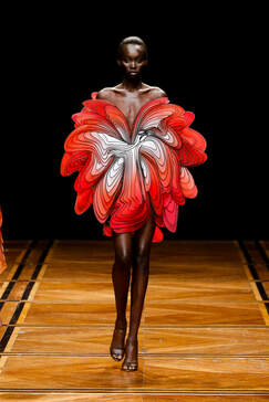 Iris Van Herpen is a 34-year-old Dutch fashion designer who blends cutting edge technology with classic motifs. She started her own label in 2007. Van Herpen's most recent collection, Shift Souls was showcased at Paris Fashion Week and featured dresses that play with structure and color to blur the boundaries between fashion, technology, and art. Van Herpen's work has been featured in various museum exhibitions, including the Metropolitan Museum of Art in New York, Victoria & Albert Museum in London, the Cooper-Hewitt Museum in New York, and the Palais de Tokyo in Paris. I personally love her designs. Her clothes are so eye-catching. The shapes and structures of her clothes are not the norm. There is no distinctive shapes to her clothes. For example, the shape of the dress in the picture on the left is like a big blob. I also really love the colors of her clothes as well as the design. She used bold colors and black and white. Her clothes are really daring. Her designs are special and unique. Overall, her clothes are a delight to look at. It inspires me to try to do the same with my art. www.irisvanherpen.com/
|